Brand kit

The Twin Ports EDM artwork, the colors and the type, and how to use them on a flyer, a poster or an article. Everything here is free to download.

Using it

Promoting a show in the Twin Ports, or writing about the scene here? Go ahead and use it. You do not need to ask.

Ask first before putting it on merchandise, or using it in a way that suggests Twin Ports EDM had a hand in running your event.

Use the files as they are rather than rebuilding them. If you need something that is not here — a different crop, a particular size, a one-color version — ask, and we will make it.

The artwork

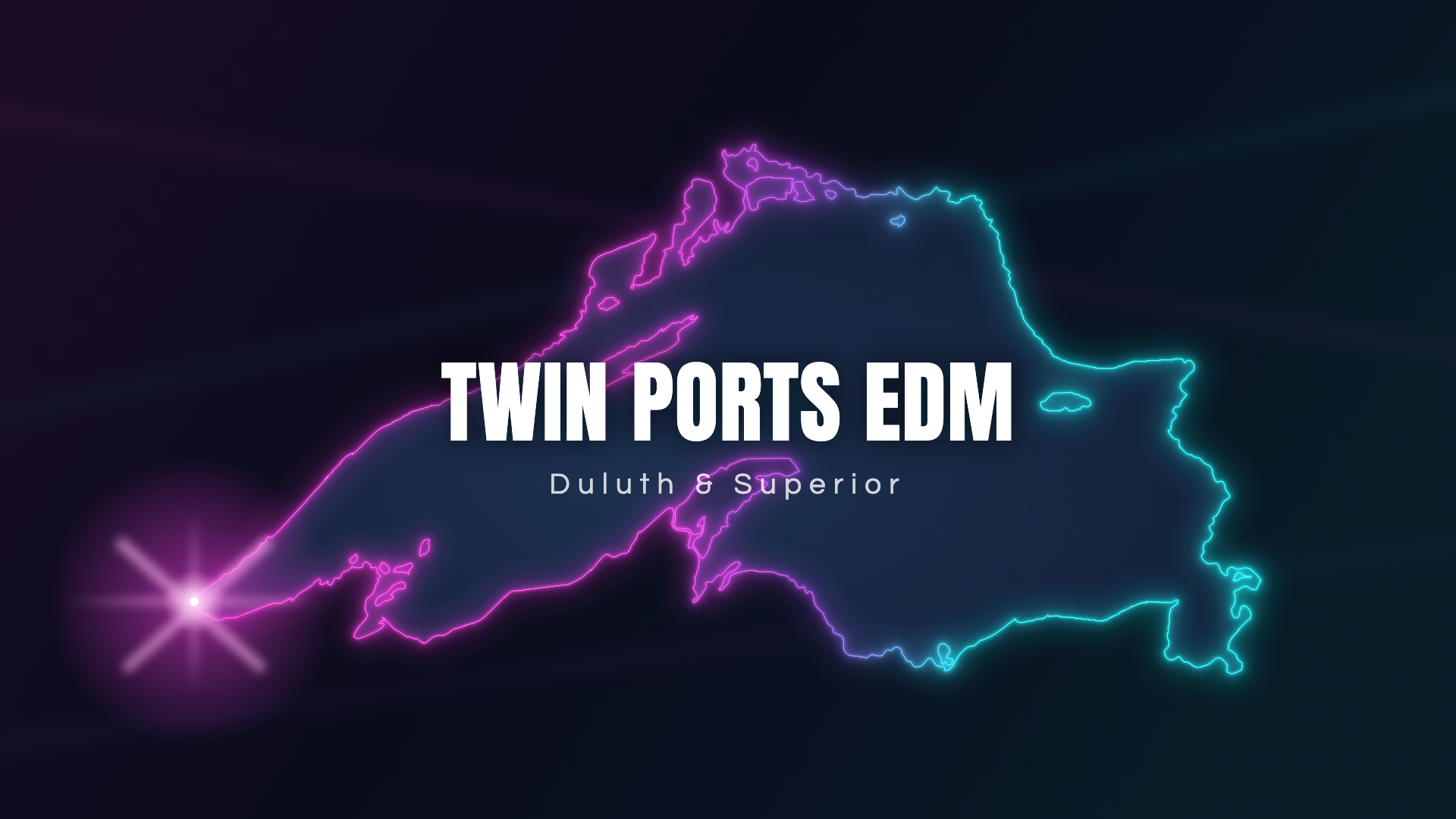
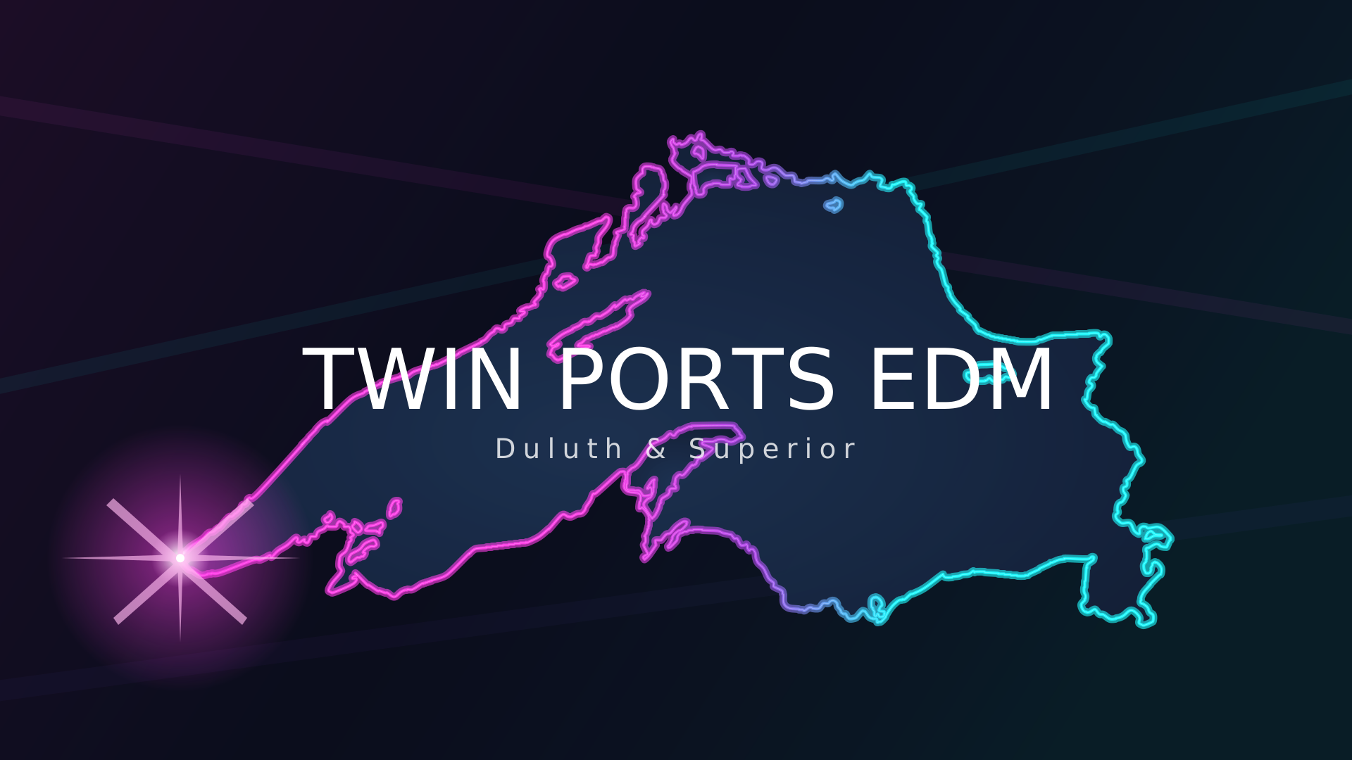
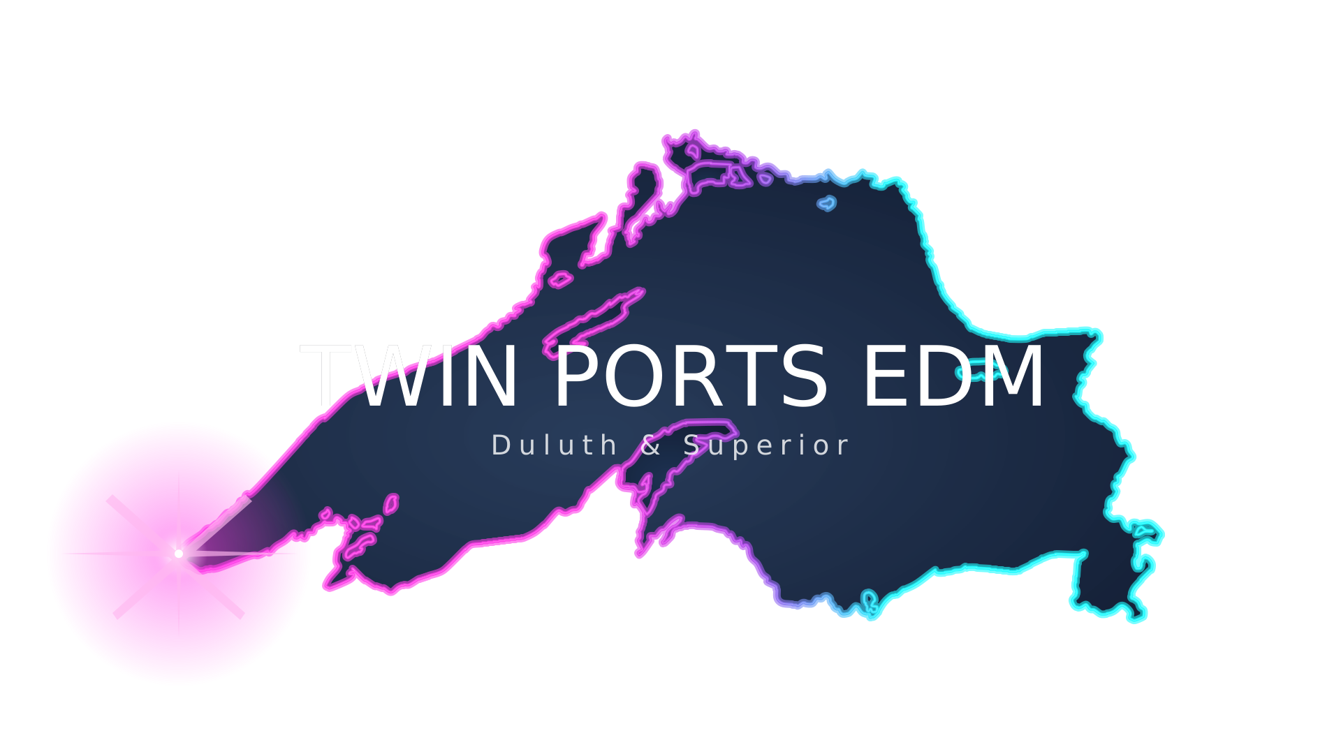
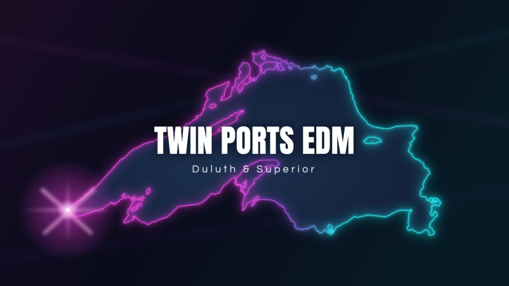
Twin Ports EDM banner — neon outline of Lake Superior with the Duluth and Superior shoreline in magenta and cyan

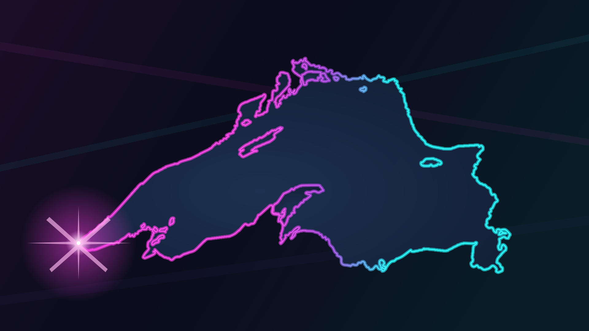
The shoreline is Lake Superior. The glow runs magenta at the western tip, where Duluth and Superior are, through to cyan at the eastern end. The bright point of light is the Twin Ports.

Download

Every version comes as SVG (vector — use it for print and anything large) and PNG (for screens and social). The transparent PNGs have a real alpha channel.

Each preview sits on the background that version is built for. A checkerboard means the file is transparent — that is the preview showing through, not part of the artwork. Click any preview to see it full size.

Full artwork previewFull artwork
Background: dark navy
The standard version.
SVG · PNG
Full artwork, no wordmark previewFull artwork, no wordmark
Background: dark navy
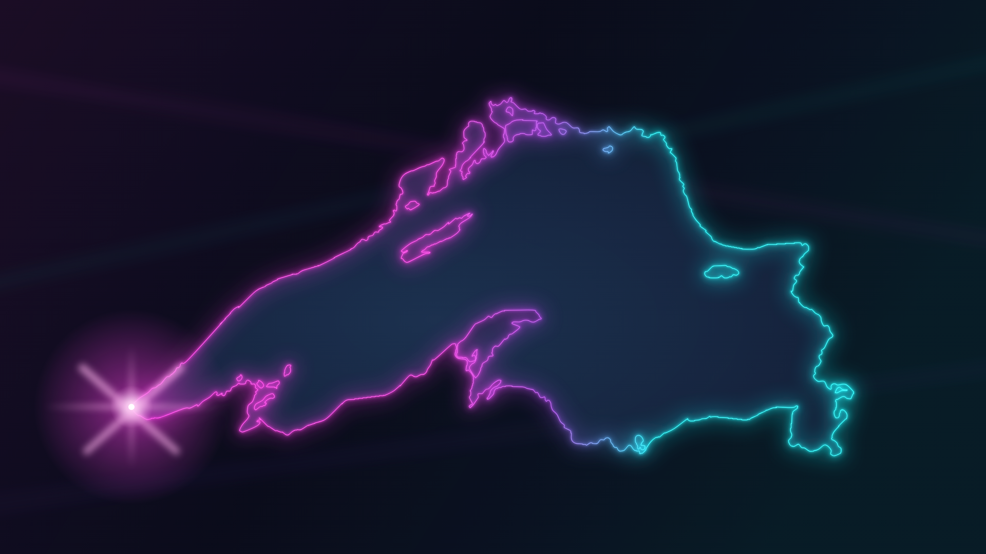
When your layout already carries the name.
SVG · PNG
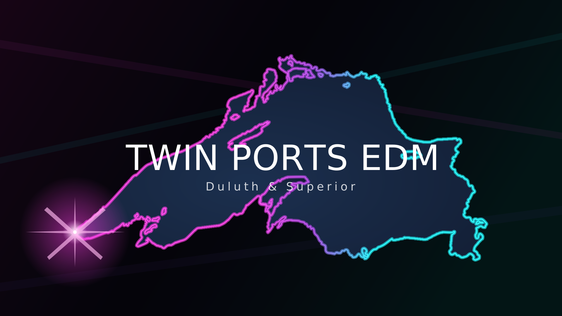
On pure black previewOn pure black
Background: #000000
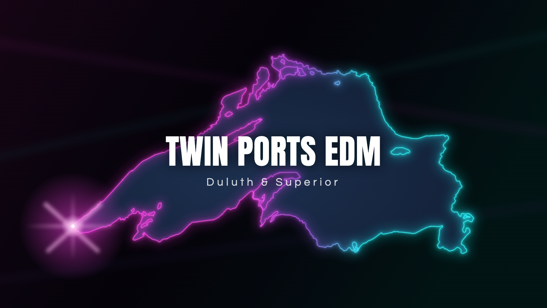
Use this on a black flyer — the standard version’s navy will show as a lighter rectangle.
SVG · PNG
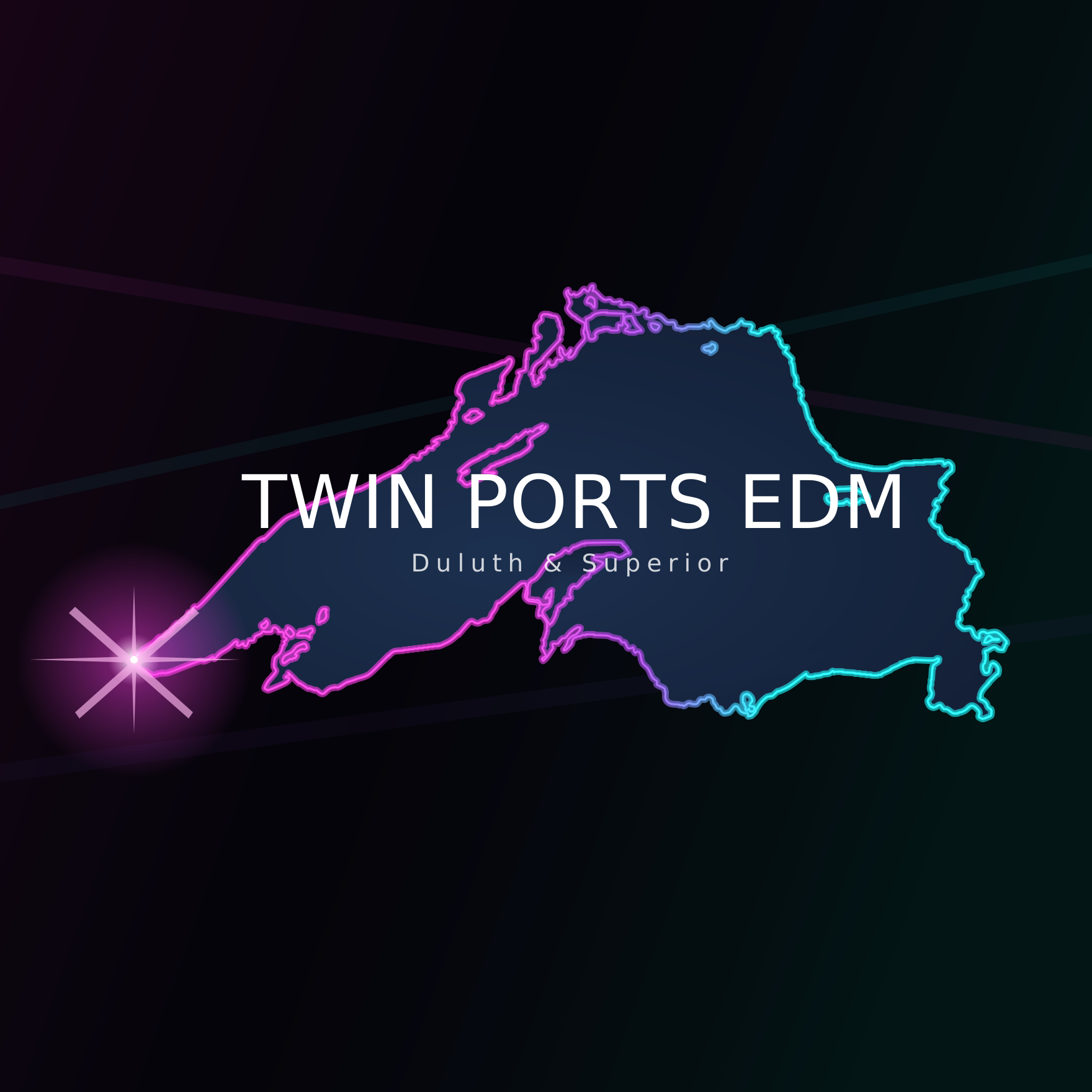
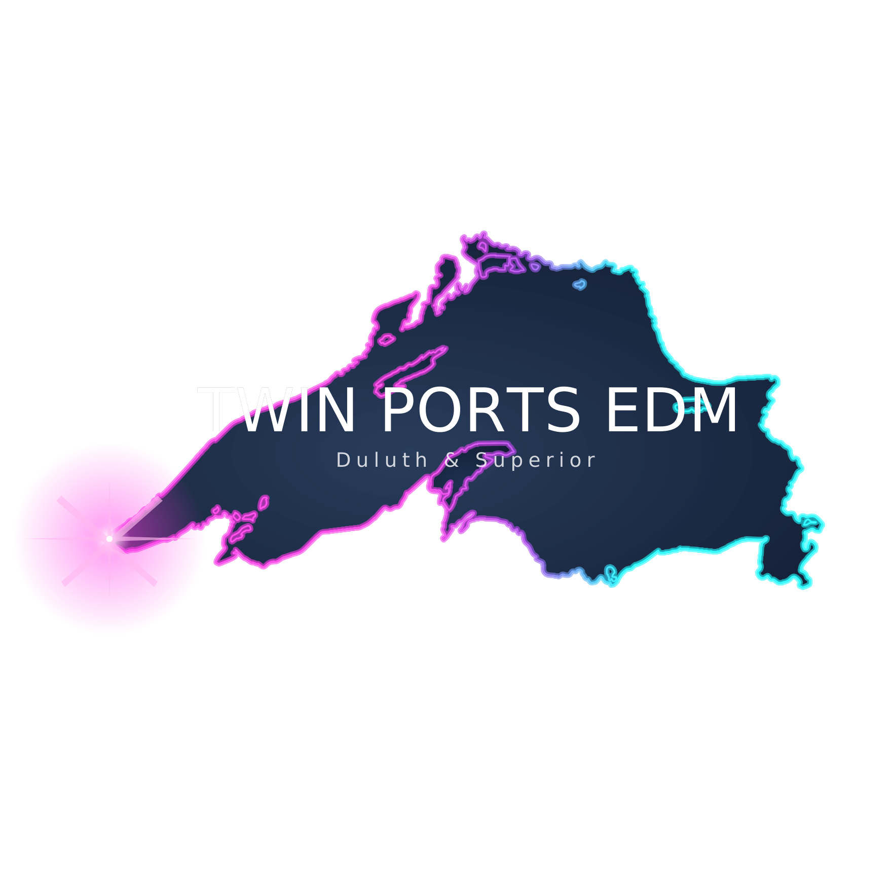
On pure black, square previewOn pure black, square
Background: #000000
Whole lake, nothing cropped.
SVG · PNG
Transparent previewTransparent
Background: none
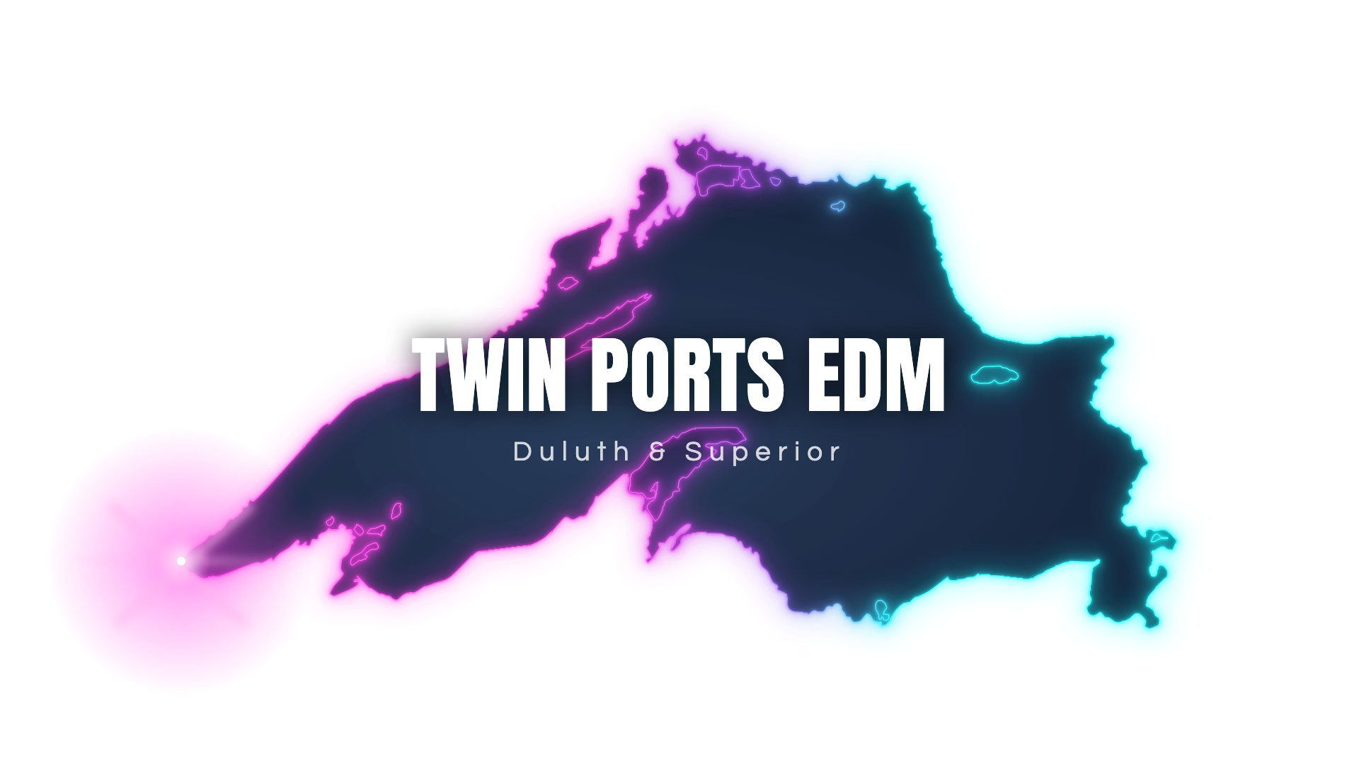
Drops onto any background. The lake keeps its own dark water.
SVG · PNG
Transparent, square previewTransparent, square
Background: none
Whole lake, nothing cropped. The one to use in a square space.
SVG · PNG
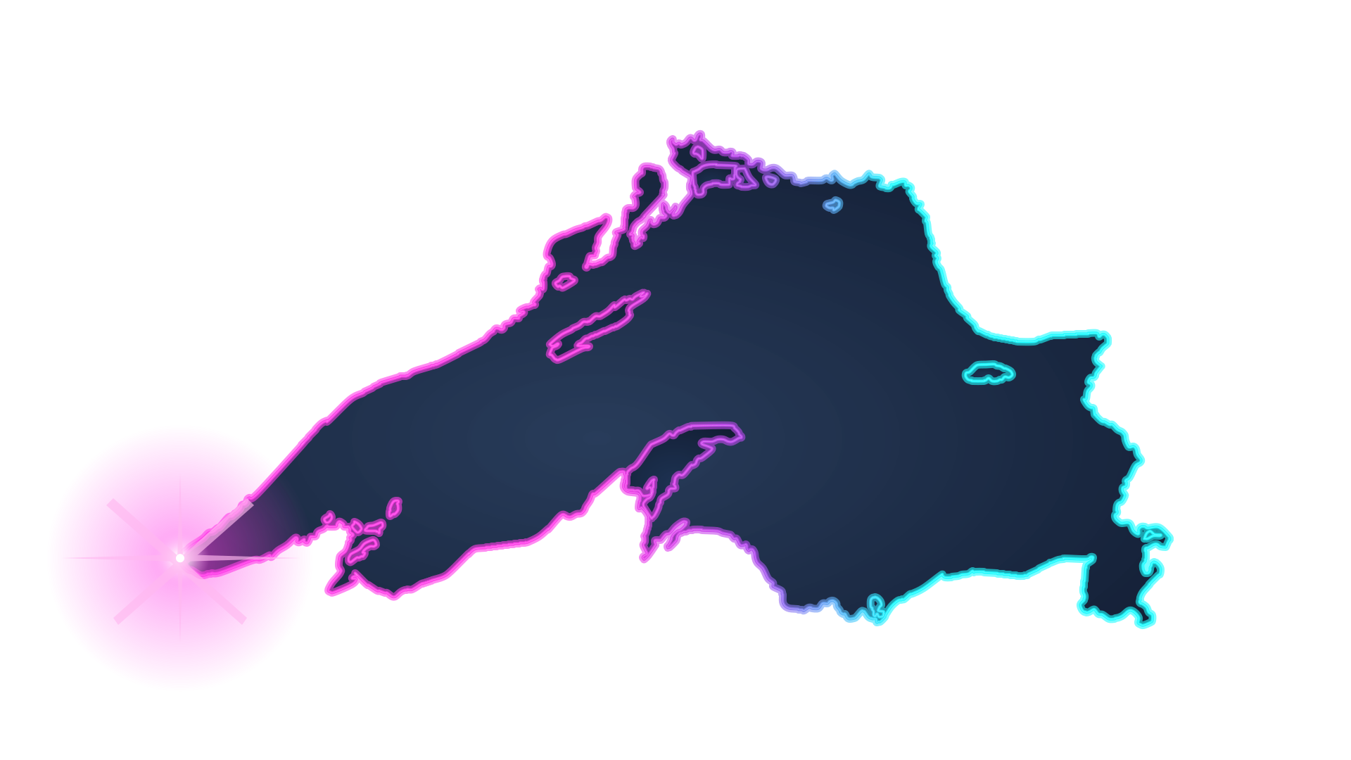
Transparent, no wordmark previewTransparent, no wordmark
Background: none
SVG · PNG

One color

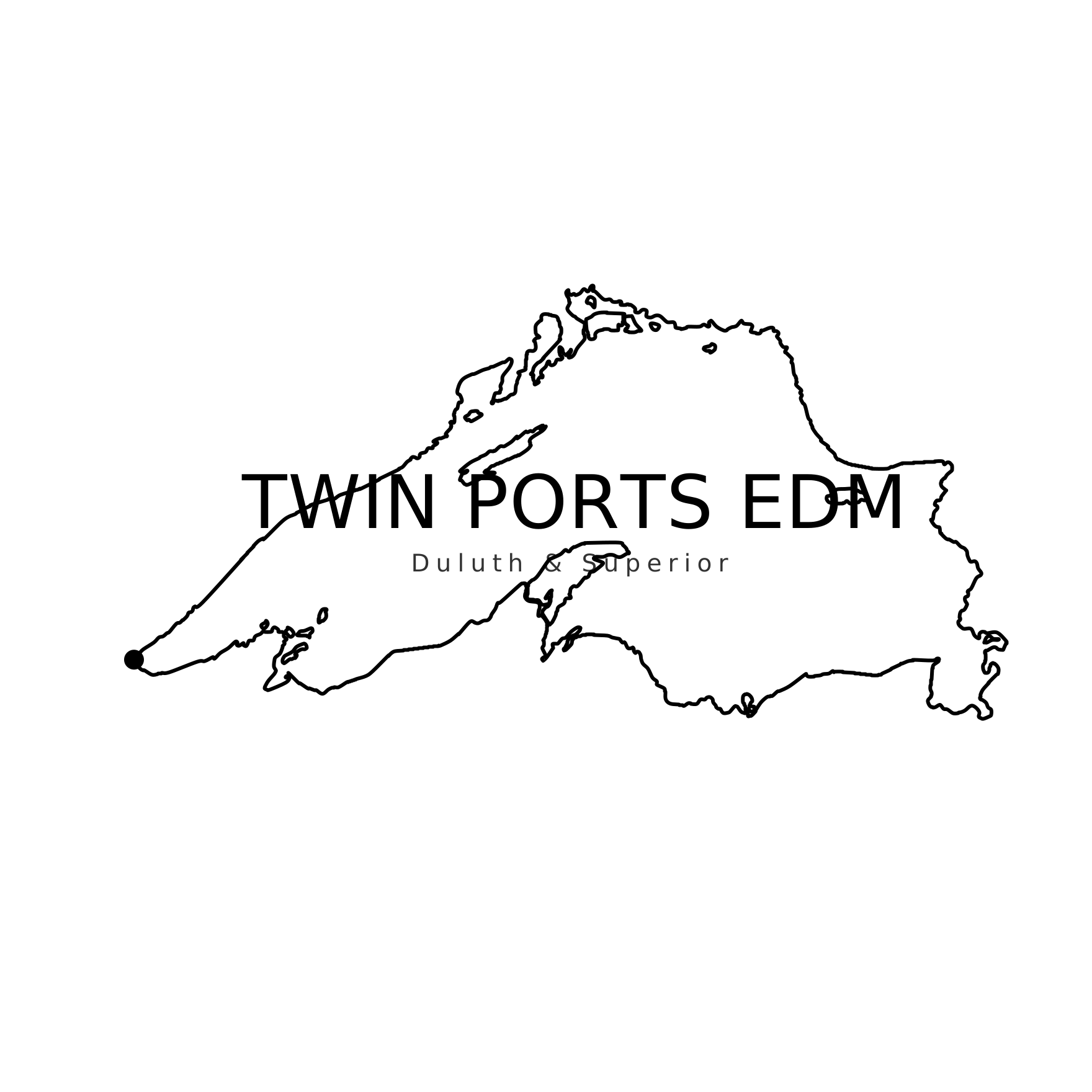
Line art for one-ink printing — screen printing, newsprint, embroidery, a stamp. The glow is deliberately gone: a glow printed in a single ink turns into a gray smudge.

One color - white previewOne color — white
Background: none
For dark paper, or a single light ink.
SVG · PNG
One color - white, square previewOne color — white, square
Background: none
SVG · PNG
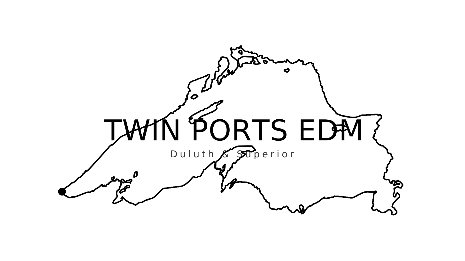
One color - black previewOne color — black
Background: none
For white or light paper, newsprint, a stamp, or anything printed in one ink.
SVG · PNG
One color - black, square previewOne color — black, square
Background: none
SVG · PNG

Ready-made sizes

Cut to fit specific slots.

Square, cropped close previewSquare, cropped close
PNG 1080×1080
Profile pictures. The wordmark fills the frame; the ends of the lake are cropped.
PNG
Facebook group cover previewFacebook group cover
PNG 1640×856
PNG
Facebook page cover previewFacebook page cover
PNG 1640×624
PNG
Largest wide image previewLargest wide image
PNG 2560×1429
PNG

Color

Ink
#060913
The background everything sits on.
Raised
#080E1C
Panels that lift slightly off the background.
Magenta
#FF3EE8
The Duluth end of the shoreline.
Cyan
#1FFBFF
The eastern end.
Purple
#CB85EB
Where the two meet.
Soft blue
#7FC8F1
Quieter detail.

These are built for dark backgrounds. That is where neon reads as light rather than as a colored line.

On a light background the magenta and cyan are too pale to read. If you need the brand colors on white, use #C630B4 and #108284 instead.

Type

Anton sets the big line. Questrial, tracked wide, sets the small one. Both are free on Google Fonts and both are in Canva.

Neither has a bold weight. If you set them bold, your software fakes it and the letters thicken in the wrong places. Make them bigger instead.

Putting it on a flyer

  1. Pick the version that matches your background. The full-color artwork is light being emitted, so it needs something dark behind it — use the pure black file on a black flyer and the transparent one over a dark photo or color. On white or light paper, use the one-color black version — that is what it is for. Do not drop the neon artwork onto a white page and hope.
  2. Do not mirror it or change the colors. The magenta end is Duluth. Flip the artwork and Duluth lands on the wrong shore — people here will spot it immediately.
  3. Do not stretch it. It is 16:9. Scale it or crop it, but keep the proportions.
  4. Leave room around it. Keep a clear margin on every side at least as deep as the height of the W in the wordmark.
  5. Do not go too small. Below about 440px wide on screen or 95mm (3.7in) in print, the Duluth & Superior line turns to mush. If you need it smaller, take the version without the name and set the name yourself in Anton.
  6. For print, use the SVG. If it is printing in full color, proof it first — neon this saturated is hard for CMYK and comes back duller than it looks on screen. If it is printing in one ink, use the one-color files and skip that problem entirely.
  7. The one-color version has its own floor. Its line is built to survive down to about 95mm (3.7in) wide. Smaller than that and the thinnest parts of the shoreline start to break up on press.

Please do not

  • Put the full-color artwork on white. There is a one-color version for that.
  • Lay any version over a busy photo. Give it a quiet area to sit in.
  • Retype the wordmark in a different font.
  • Redraw or simplify the lake.
  • Add effects to it — shadows, outlines, extra glow.

Questions

Ask in the Twin Ports EDM group on Facebook, or message @twinportsedm on Instagram.